Week 1: Photoshop Art.
Approach:
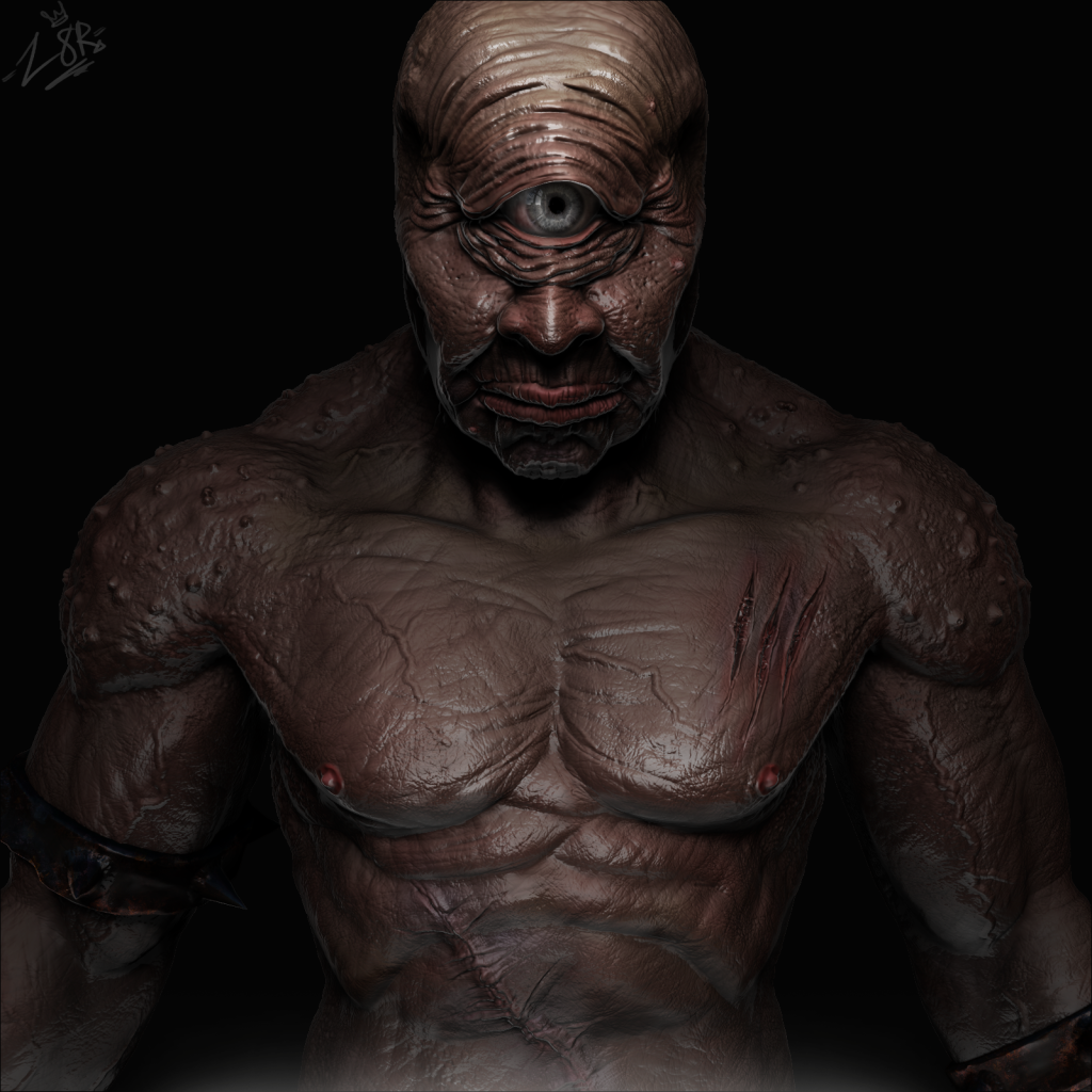
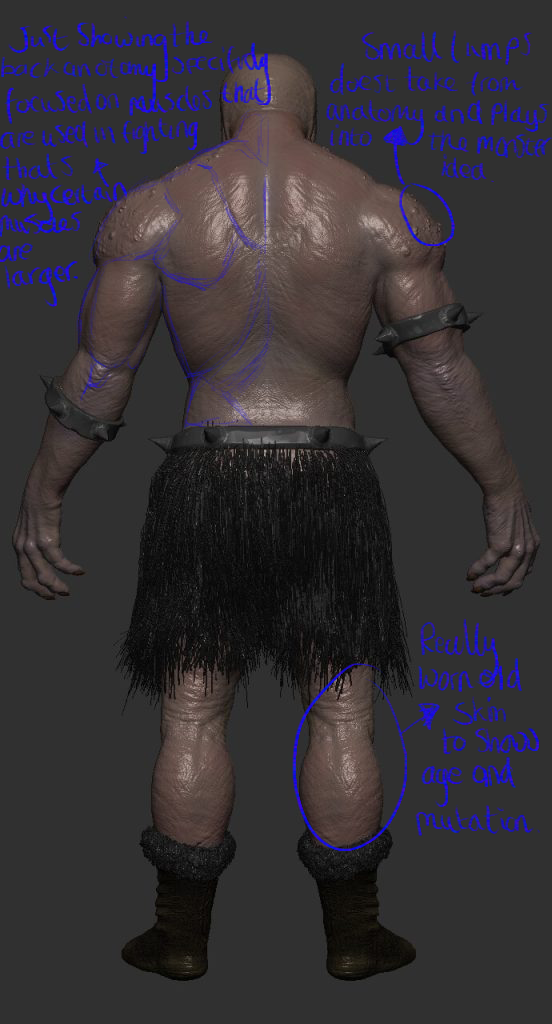
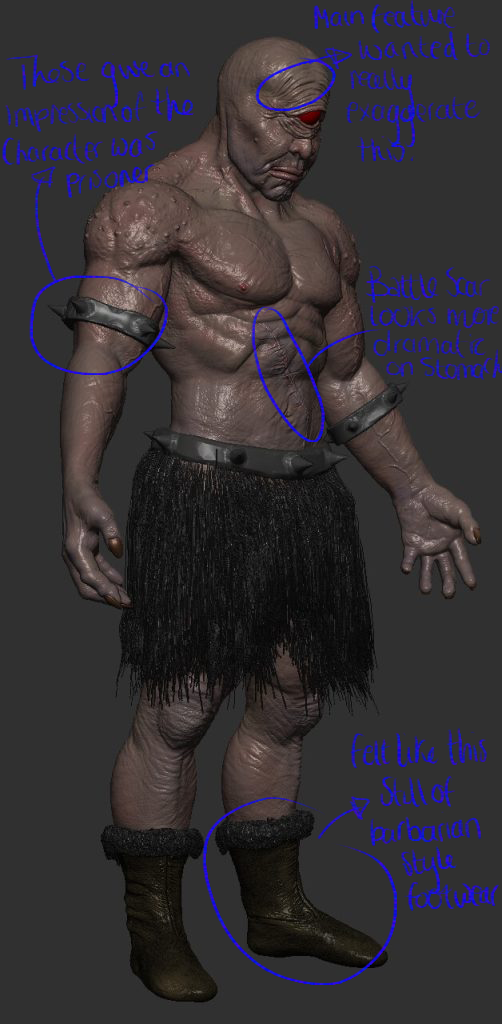
This was the final piece of the concept character design, the aim was to character your own character concept, for this I wanted to create a cyclopes giant; my idea of the theme with this character is spartan/ roman style. I wanted to put forwards the idea that this character was used for battle and was some what a prisoner. for this theme I had a few ideas how I wanted to show this, having a blanked expressionless face comes across as intimidatingly and slightly inhuman, having old and new wounds like cuts and scars is an easy way to show a character has been in battle or an altercation, I wanted to include some sort of restraints or aged restraints to show he was a prisoner previously.
Process:
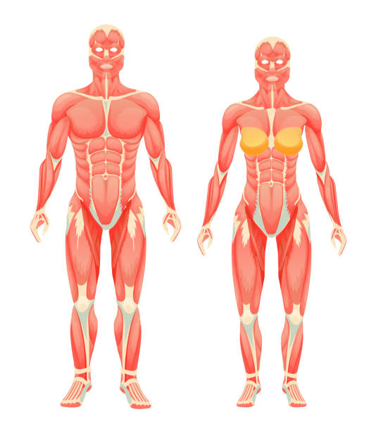
How I started this piece was within Zbrush where I began sculpting the basic shapes and layout of my character working alongside the references I found previously, blocking out the model to start with is necessary for a few reasons such as helps you understand how everything will look in a basic way and posing a character before adding a lot of detail is so much easier therefore it generally helps with the process. once the blocking stage is done I started to increase the resolution of the model and merging parts together, this allows me to steadily increase details through the model, in this stage I was basically getting muscle groups/ anatomy realistic on the character referring to the anatomy images below, this is really important as it starts your basic foundations of your character forming how you want it. this next stage is is increasing the subdivision on the model and where a lot of detail such as skin, scars, veins and anything to exaggerate the realism is applied; I spent a while focusing on this part because I wanted to make sure the skin came across as realistic because slightly mutated, to get this effect I create my own brushes that sketch skin onto the model this is done by changing the alpha of the brush.
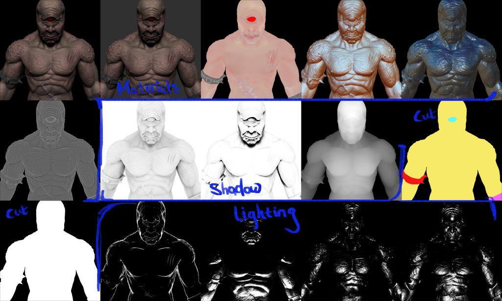
After repeating this process with the cuffs on the characters arms, waist and footwear I starts to hard surface paint the model, in the future I hope to be able to retopologies my models and applies colors in a more advanced way so that my work is more professional and more realistic. this stage is me just using a paint brush and drawing over the model, this consists of a lot of blending altering hardness and opacity so that a certain color doesn’t come across to harshly. Rending my concept image shown in the multiple pictures above; the base two images, then the materials to exaggerate skin tone or a metal affect on the cuffs, the shadow render passes really added to the realism, the lighting again helps wit the realism of the image. Once I’ve sent all these to photoshop I just tools such as masks to sketch in lighting where and where not is necessary and using the blending mode which I found really helpful to merge these images to get the result that I did.
I didn’t want the character to have have for example a perfect anatomy style and what I mean by this the traditional six pack that is symmetrical; still wanting it so come across as in physically god shape because I wanted to keep the idea of it because used for battles which is why certain muscles like the biceps, shoulders and generally upper body is built and a focal point this is due to the idea that these muscles would be the ones used more by this character. the lumps/ spots on the shoulders breaks again the idea of him being a human and puts forward an idea of mutations but very subtle because I didn’t want to over do that concept and make the character just look confusing.
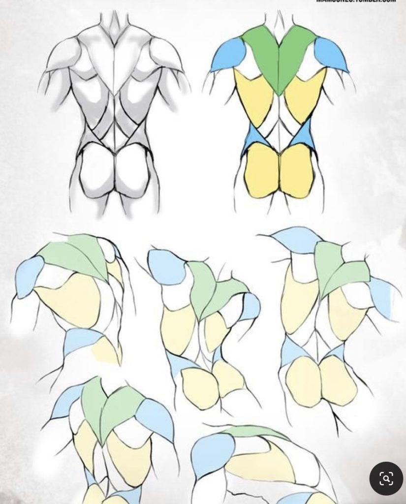
I personally throughout this I find images like this really helpful as a guideline for me to stick alongside because but can sometimes break to make the character look more interesting, even more so the lower images on the right, if I was to pose my model would help me see how the muscles move on the body.
Inspiration:
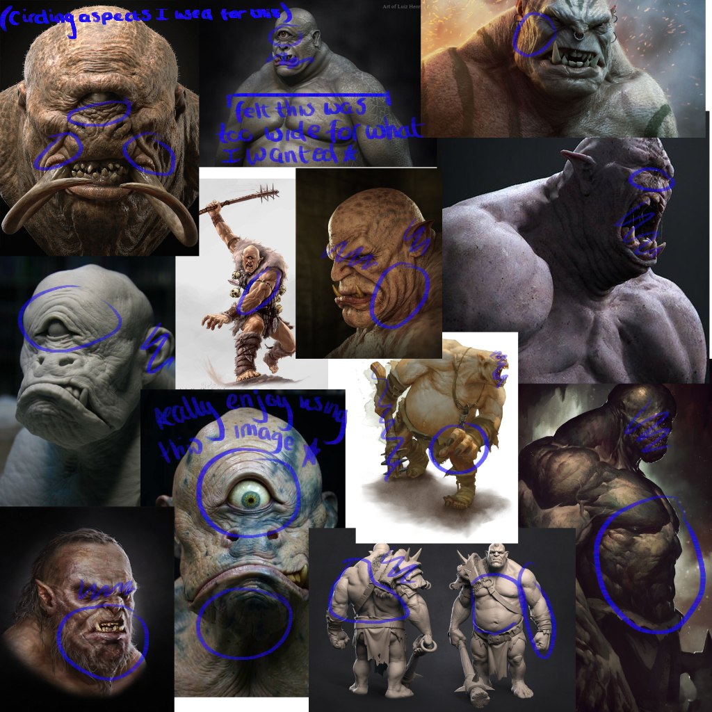
With creating my own 3d model for this concept art and trying to get it to be as realistic as possible getting inspiration was quite easy, in the mood board above i have circled what I was mainly focusing on in each picture. The top left one in particular I enjoyed using very much for a number of reasons such as how the skin on the face seems to all push inwards to the eye and the nose really creates a creepy and deformed look without loosing what the character actually looks like, another aspect which I liked was the tusks coming from its mouth however this was something i didn’t interoperate in my own this is because with my character I didn’t think it firstly suited there proportions i felt its better for a larger character and I wanted the eye to be the center of attention.
Improvements:
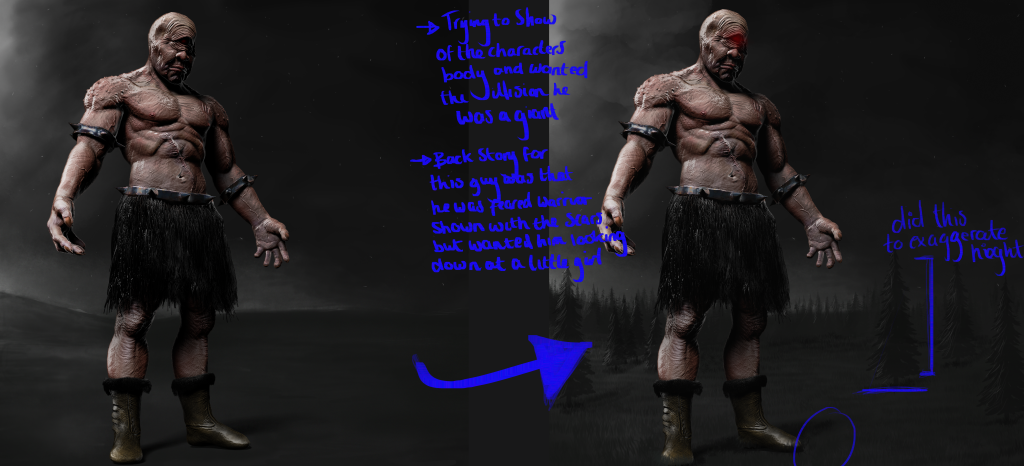
This was my original end result of image as states on the image in my notes briefly my idea was that to show the view for scale have the main character looking down at a little girl also thought this would be a little bit more impact for the view to see a prisoner of war stood before a helpless child; as states again I also sketch a horizon and trees again to show that this is a giant not a man sized creature. However I didn’t like this end result felt the glow on the eye looked unprofessional and the stance didn’t suit the image and is something I aim to learn further for the next time I do a character design.
Learnt:
This project helped me learn and understand how important/ helpful using references alongside the work process is, having multiple images to take little ideas from as i am sculpting and drawing was so helpful and is something i am definitely now gong to take into all of my artwork.
References:
All images from which I take inspiration from in terms of the character design I gathered from Pinterest. 2022 Pinterest.
Both images I use for anatomy i screen grabbed from google images 2022.
Week 2: Photo Manipulation.
Approach:
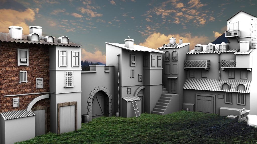
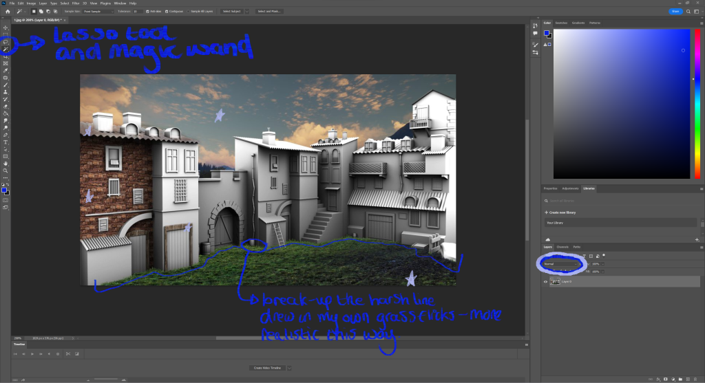
The aim for this this weeks project was to use photo manipulation within Photoshop, my initial ideas for this was to find a pre-made 3D scene from online and using similar skills from my character concept to make it seem more realistic because i was aiming for this realistic style again i didn’t want to attempt anything like explosions, planes or as some sort of battle field; my goal was to create an area which had been abandoned in some woodland area.
Process:
My start to this project was to find a 3d modeled scene to start with, why i chose a 3d modeled scene is because they automatically come with shadow and depth which makes achieving realism a lot easier, this it was to get all images i wanted to photo bash into the scene and this consisted of the sky, the building bricks, grass, wood and a metal texture; this sometimes became challenging due to a number of reasons like if images i liked didn’t match the resolution to the rest of the image i couldn’t use them others had a different lighting on them which again made it feel odd however with this i could alter the brightness levels and color pick the layer to the scene. Personally i am partially impressed with how the grass came out i feel like it belongs in this image, how i did this was after finding the image of the grass, put it over the scene and using the cutting tool removed parts that didn’t follow the shape of the building, this then left me with a sharp unrealistic edge of the grass therefore i color picked from the different shades in the grass and drew in flicks trying to replicate the grass over grown slightly up the building.
This process was pretty much the same for all the other parts of the scene, bricks; copy and pasting the image, merging together then cutting them around the shape of the windows to finally use the blend tool which i circled in this image and set them as a multiply because i wanted the image of the bricks behind the baked in shadow. something which was challenging through this was getting the perspective right, as you can see the building is at an angle and the bricks were initially a flat image and this made the image look confusing, what i did was in the transform tab use the perspective tool to give the illusion the bricks come from an angle i did this so the realistic feel throughout the image was consistent.
Inspiration:
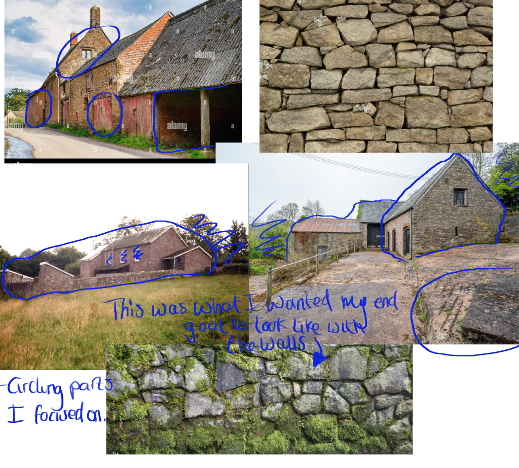
Below are the images i was using for my inspiration to this project as i thought there would be a lot of brick work being used in this image i wanted to see what different styles looked like from different angles in the end i decided to go for the more messy style of brick laying and this was because i felt that it played in to the abandoned theme that i was trying to achieve more because it looks less stable and safe built like this. Two images have grass within them as well as buildings i chose them this way because i wanted to see how what and how things grew around buildings so that i could get it as accurate as possible. the image with the moss on the bricks is what i wanted to subtly sketch into the bricks later in the process to again exaggerate this abandoned look.
Improvements:
An obvious one to improve is that i wanted to complete the overall image i was enjoying see how the scene was coming to life. another improvement was the roof, i felt that i could get the texture right on it this could be just due to the bad texture i was using but i feel the shape of it was hard to work with.
Learnt:
Throughout this process a thing i learnt was how dramatic of an effect braking up a silhouette of a texture is this came from doing the grass and adding them additionally flicks of grass to the scene and this is definitely something i will be using in my artwork in the future.
References:
All images of walls and farm sites were found on Pinterest 2022.
Week 3: Buttons for UI.
Approach:
With this weeks project I was told to make a button for a Ui which i would later be using within a game, the game was had the same functions as cookie clicker. My thought process before starting this was that i wanted to create something funny and something which people would recognize so that the end result would seem much more interesting. Being a big fan of Ali G i chose for this to be themed around this character as i feel sound clicks i could of added would make the game in the future funny to play.
Process:
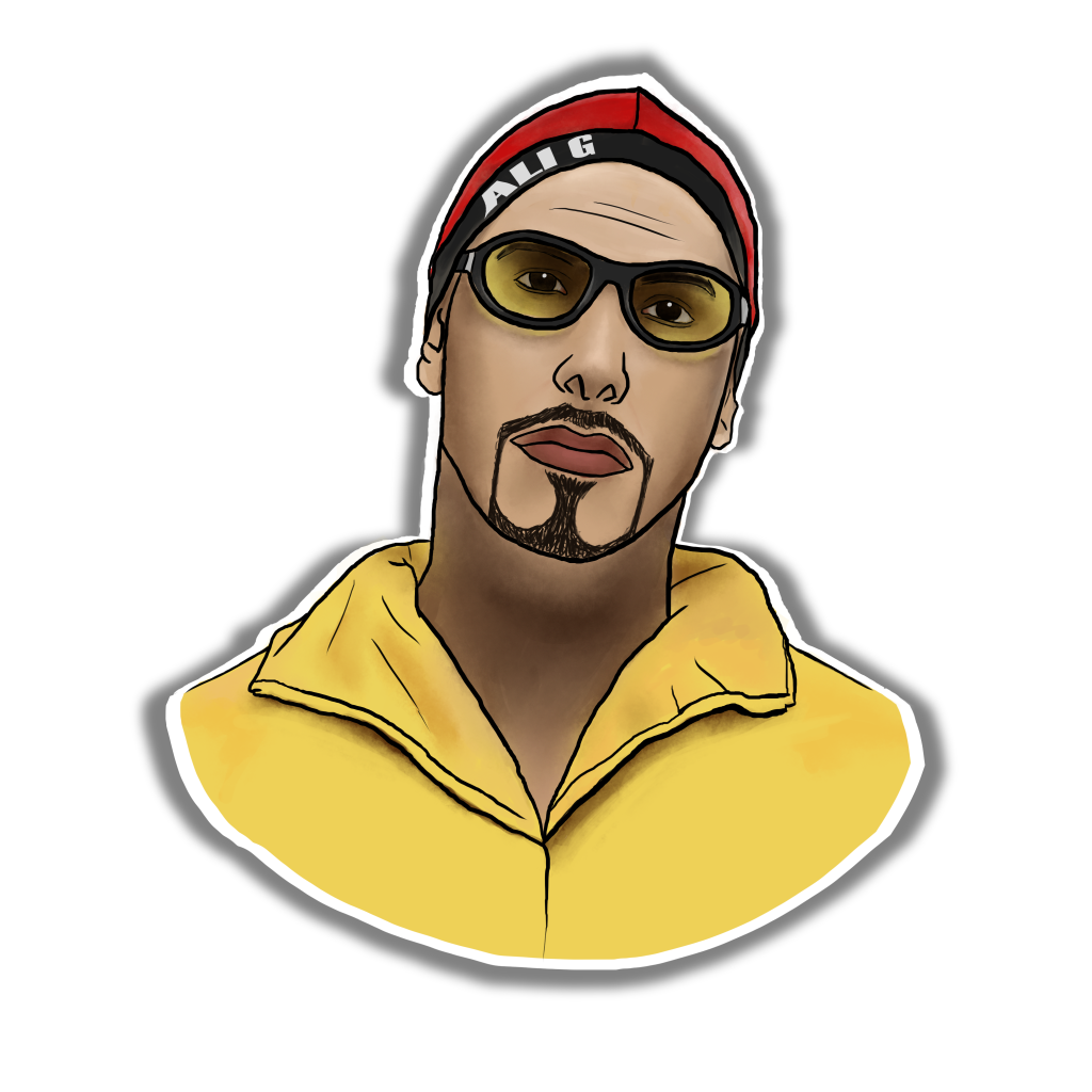
How i created this image for the button was quite simple, the idea was to make the character more stylized and more animated this was so that it could match the rest of the theme with the game; all i wanted to find online was a clear image of Ali G for this, for a few reasons people can easily recognize it as him and be more interested and because i wanted it in the center of the screen its more impact for the player. how i drew this image consisted of me lowering opacity of the image Im using to trace from and sketching over, staring with a black outline to get the cartoon style and color picking from the image, to still keep some realism i sketch in same shadows and darker tone to the image so that it looks a bit more professional. Due to the fact i was making a button i added the white boarder and shadowed background to give the illusion to the view that it is a button and can be pressed.
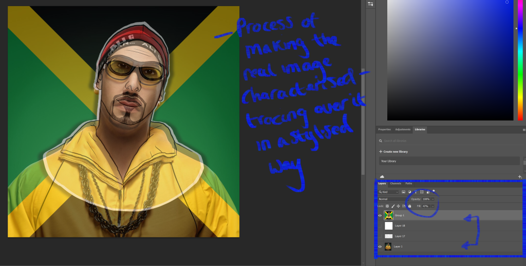
Lowering the opacity on the main image i am using helps me trace the image and makes the overall image more accurate to the image Im copying off, as you can see in this image i didn’t want to include the chain and this was because i thought in the future i might was to include the chain as some sort of update/ upgrade which the user can purchase during the game.
Inspiration:
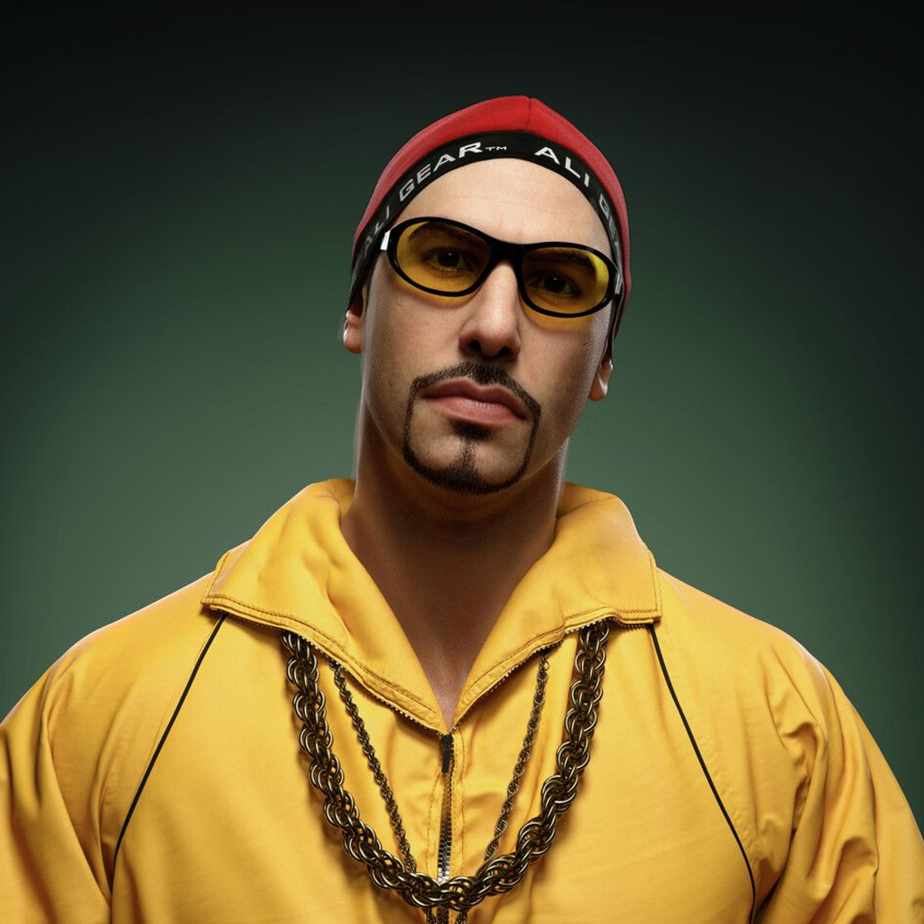
As I was wanting find an image to trace from I didn’t really need any other images for inspiration, why i liked this one is the colors are very bright and bold which i feel is good for drawing attention to the game in the end. Another reason why i chose this image is because of what he is wearing within the picture, for his charcater this outfit is quite iconic and people can easily understand who it is by this.
Improvements:
Overall i am quite impressed with how this had turned out as i don’t really do much drawing like this, if i was to improve on anything with this final outcome i would of drew the zip to the jacket that he was wearing instead of leaving it as just a line and maybe drew one of the smaller chains he wear and saved the bigger one for some what of an upgrade.
Learnt:
What I learnt when making this is how helpful lower the opacity on different levels when using multiple layer in Photoshop, this became really helpful of getting the image accurate and is a skill which i plan on using in my future artwork.
References:
Week 4: Perspective And Composition.
Approach:
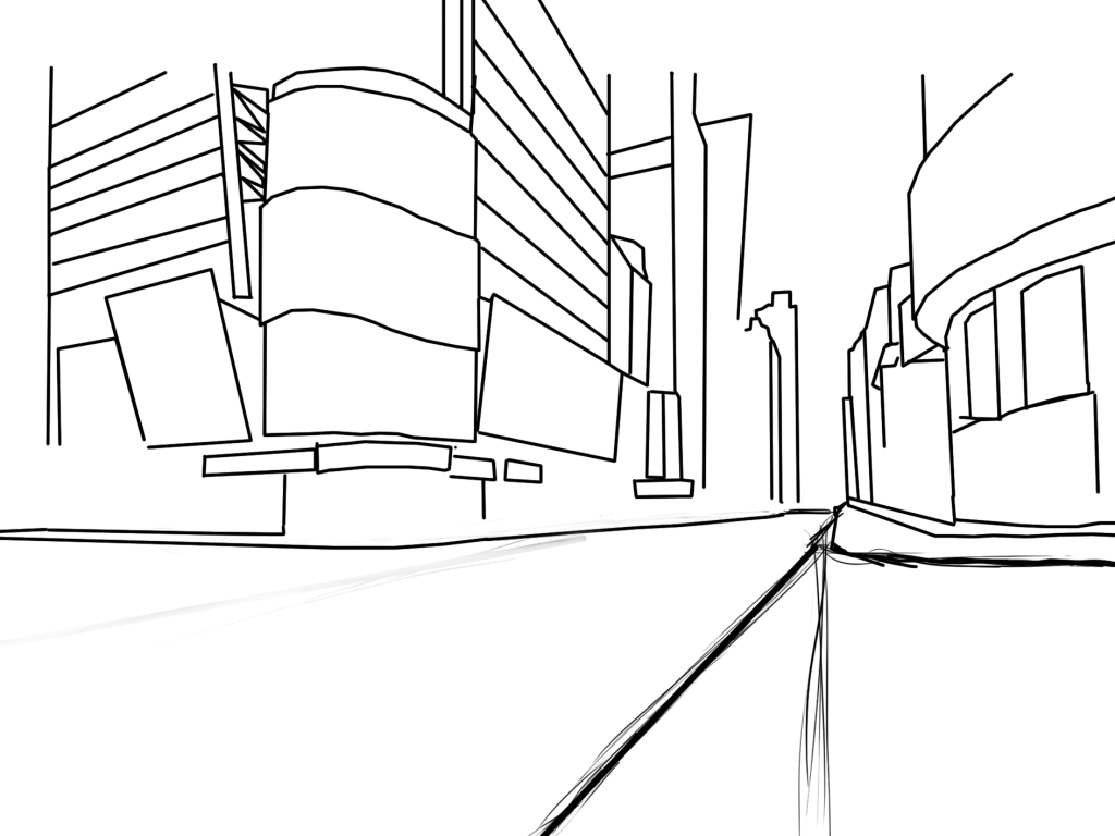
For this project I was ask to explore perspective and composition by creating an interesting environment before making this image I wanted to try and use straight-line work in photoshop as it wasn’t something I had experimented with in this assignment, this then lead me to want to create a town/ city which is why the image ended in looking like this.
Process:
to help with the composition and perspective in the image I was using this perspective table, this helped by giving me guide lines to have a rough idea where certain things should be, in this case the darker circle is to tell me where the depth of the image should be therefore I included the long round which you could also see buildings that got smaller further down to give the illusion that they are further away. how I was able to create this was with the back and further referring to the references and the paint brush, with the paint brush i held shift which created this straight line which would snap together.
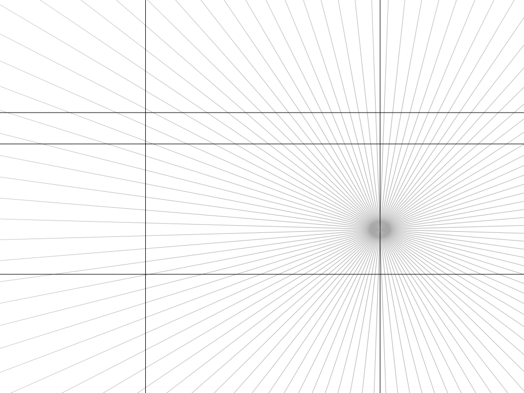
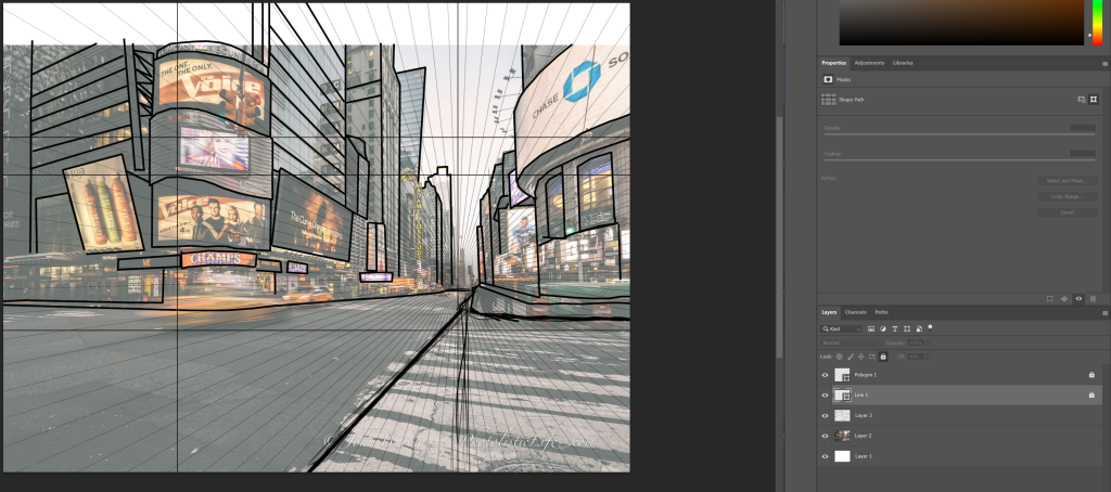
How I did this within Photoshop was having it behind the main image layer then lowering the main image opacity so the guide lines came through so that I could work on the image as well. this way is much more helpful because it is more accurate and is a faster process.
Inspiration:
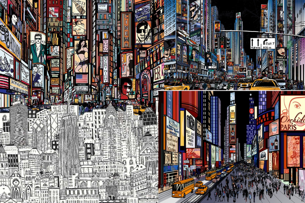
Before starting this piece I found these image which I really like because of how busy they are yet how clear the portray what is happening in them. In terms of perspective and composition, I felt this style shown this in the distance of buildings really well, the further way they were smaller they got and the less detail they had on them/ the smaller the details got.
Improvements:
feel like the piece would have looked a lot better with a dark background and would of exaggerated the depth of the image further, like the reference in the top right. Another improvement i would of liked to continue with would be the amount of detail on the builds, would of just made the entire image a bit more interesting and helped the user understand what is is. A final improvement i would of liked to make would be is tidying up some of the sketchy lines that i drew in the bottom of the image, i feel like it makes the image look unfinished and messy.
Learnt:
Through this specific project i learnt how helpful using guild line templates are just to exaggerate the accuracy of an image your trying to make, therefore when i create scenes in the future i feel like this is something i want to use to help my work improve.
References:
Week 5: Colour theory and shape language.
Approach:
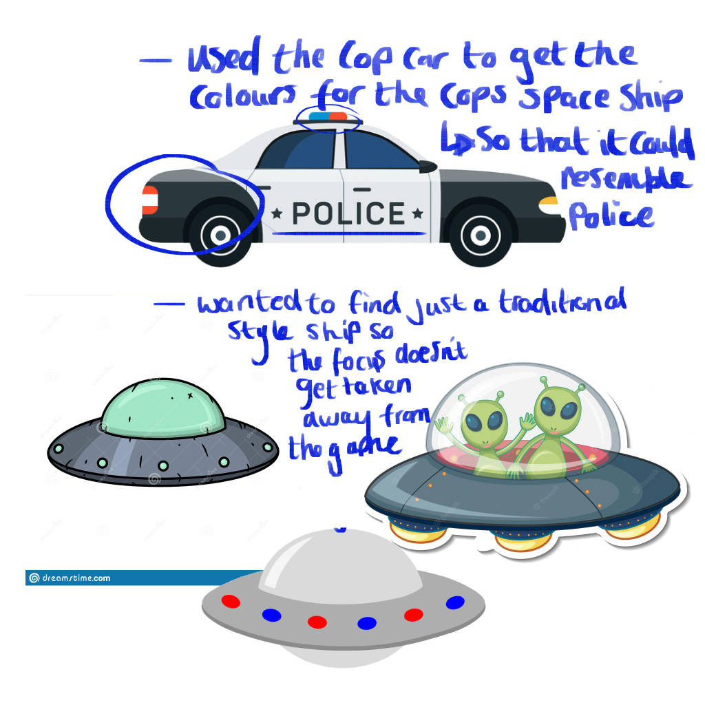
For this week the challenge was to create assets that would bet suitable for a top down shooter. my first idea was to merge the two basic ideas of a game together which were aliens and cops and robbers. felt the merge of these was a newer approach and I felt that I could do this quite effectively with the skills I had leant so far.
Process:
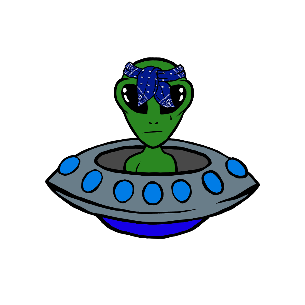
For how I created this first character was a very simple process, firstly involved me searching for the images that I seemed fit, the bandanna was to create the criminal/ bad guy look in a typical cartoon style along with the pattern I gave it, the ship i really liked how simplistic it was and because I wanted the character to shoot a gun I thought having no roof would be helpful for this; this lead me to then do my sketch and how i did this was using the magic wand I removed bits I didn’t want or need and then put them over the area that looks the best, then I lowered the opacity of the image, made a new layer then sketched over it all aiming for a more angry, criminal look.
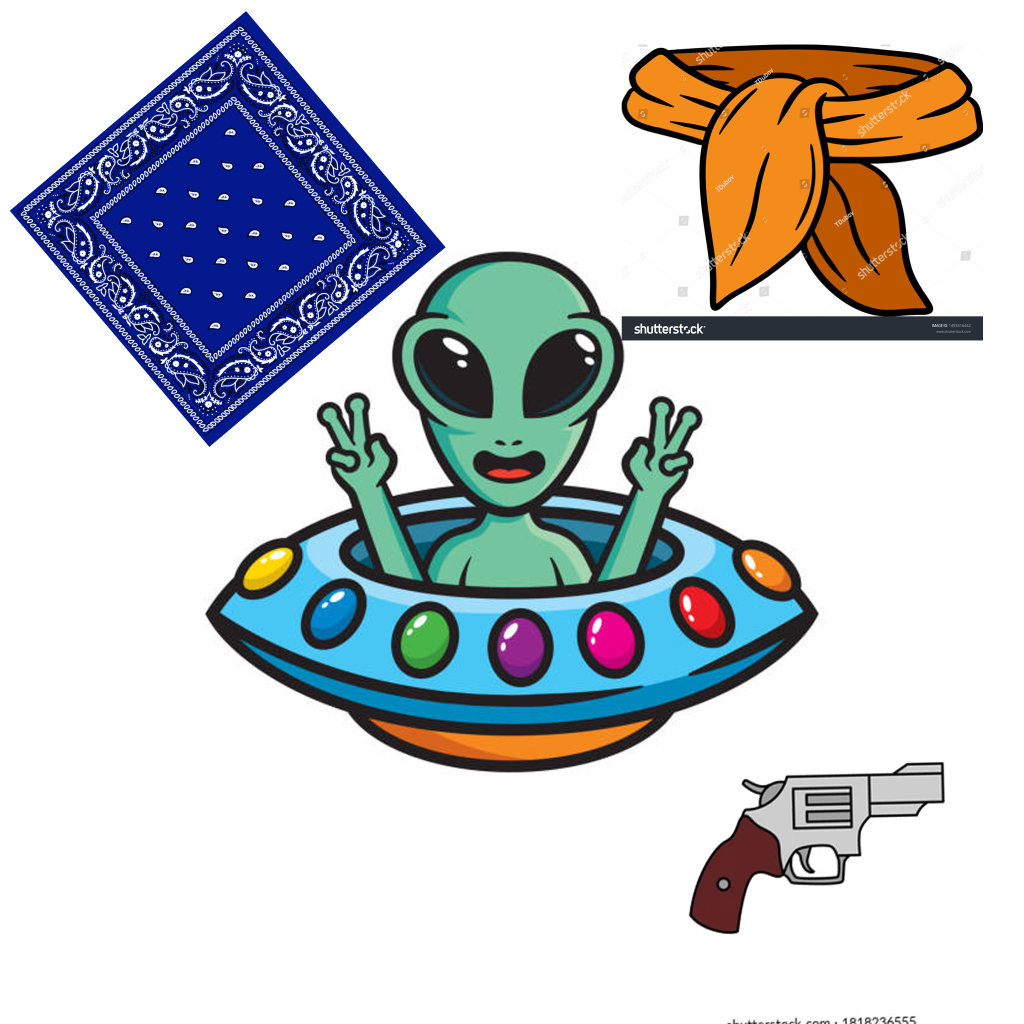
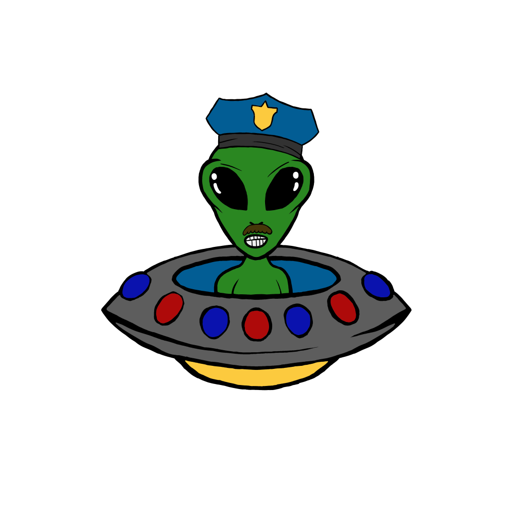
To speed up my productive time, once I finished the main character, I duplicated it, removed the bandana quite easily because I fortunately drew it on a separate layer then applied a few features which a police man has like a moustache, then I changed a few of the colors on the ship following the references of cartoon polices cars to exaggerate that this character represents a police man.
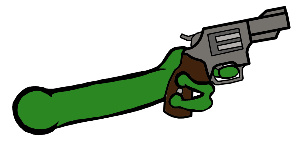
This assets I had to free draw because it had to be separate to my character for what I was using it for in unity, I tried sketching it in the same style as the character so the arm didn’t look out, this included color picking and adjusting my brush size to the same as the one I used for my character, for the gun i traced the reference above by holding shift with the brush tool to achieve the sharp accurate lines.
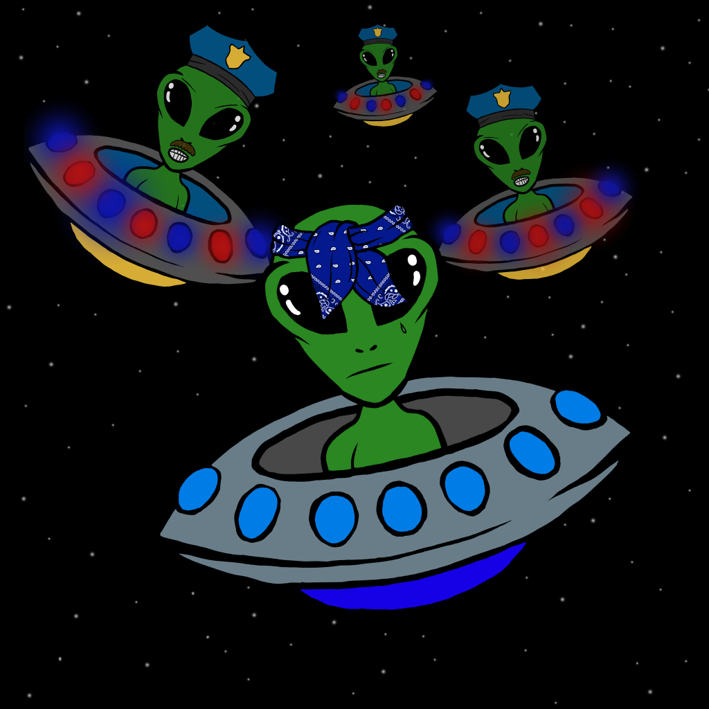
This image was a thumbnail I quickly threw together for the game which I was making, wanted it show the two main things, alien and cop an robber chase; I added onto the police a blur on the lights of the ships to represent police lights flashing and stars to further represent their in space like the game will be sent in also.
Inspiration:
I wanted a stereotypical cop car as refences only for the colors so that with the police characters in every part of their design expressed that they are the police, I felt like this image I chose shown this well with the range of colors it had on it for me to color pick off of. For the other images I wanted to have a reminder of what I should include in the space ship design just so that I didn’t stray in any other direction when drawing.
Improvements:
If I was to improve this character design for a top down shooter I think I would add a few more interesting details onto them, I started to do this with the little tattoo on the main character, I feel like this could of made the overall game just a bit more visually interesting.
Learnt:
During this project I feel like I have learnt slightly how to include my productive by using things I have previously created, this was good so i had more time to focus on other aspects of the game.
References:
All references were gathered from Pinterest 2022.
Week 6: Pixel art.
Approach:
This week I had to create something using pixel art and had to show some sort of shading technique, my idea was to create a frog because of the animation with the fly I feel could be a bit different to a lot of the stuff I have previously created.
Process:
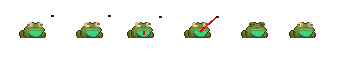
This process was simply me drawing pixels in shape of frog constantly looking at the references below, I noticed a lot of these pixel characters had a darker outline around them which made the shadow of the characters more effective which is why implemented it into my own piece, a lot had this unrealistic white bright eyes but I preferred the more diluted tired eye color because it went along with the aesthetic of the frog. in terms of the animation for the frog I wanted a slow build up to the attack on the fly, which is why I wait two frames for it to happen to build up a bit of suspense. for the shadows I didn’t want them to be exactly black or grey so I color picked from the frogs color and altered it slightly darker, to make sure the shadows were accurate I imaged where light would be coming from, in this case it would be from above the frog.
Inspiration:
In this image it brought my attention to it because of the variety of the sizes and shapes of the different frogs which I could take inspiration from, it looks like each one had their own type of personality, the style of shadow they each had also interested me which again is what I used in my own because it was so effective.
Improvements:
After looking at the references again I feel if I was to improve my own I would use more interesting colors so that is seems a bit more interesting and give it a memorable feature like stripes coming from its back or a swirl on its chest.
Learnt:
For the fact I have never attempted any pixel art before the whole process of making this character was something new for me to learnt, like opening a small enough file type so that I could get the pixelated style to drawing in each pixel so that it is effective.
References:
Week 8: Anatomy and character design.
Approach:
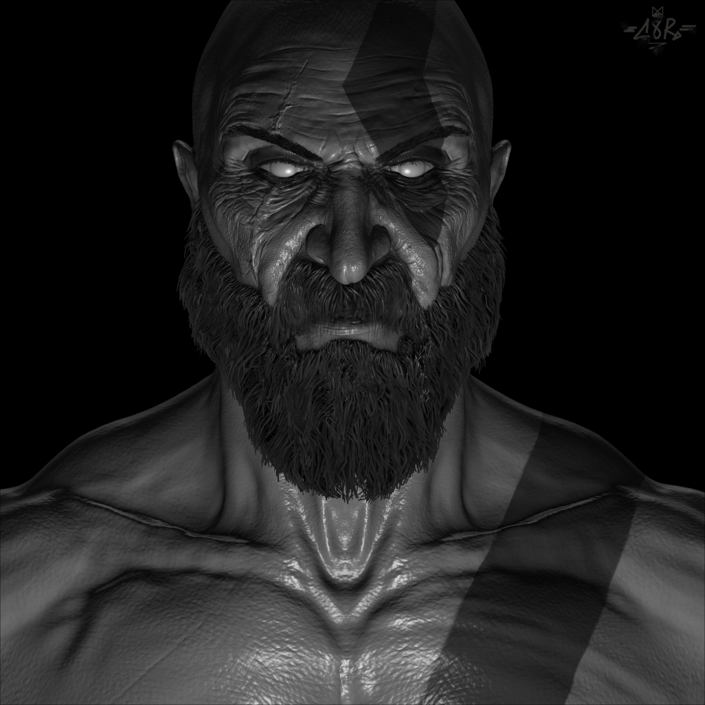
This week was to create another character design but to focus heavily on the anatomy of the character. Being a big fan of the God of war games I felt it would be fitting to create Kratos for this as a lot of his anatomy is exaggerated whilst looking really realistic due to the fact he is a god.
Process:
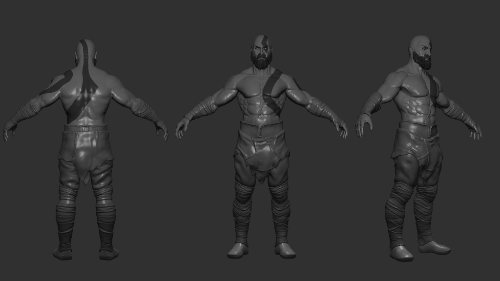
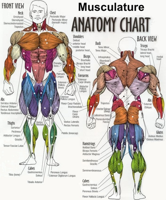
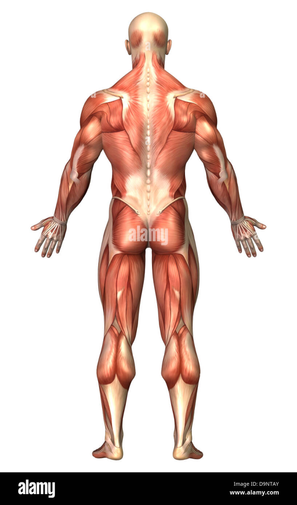
Because I was focusing on the anatomy in this design, I wanted to make sure the height and width of the character was proportion correctly, with his hands sitting just below his waist, having a head room either should side; this is how I started blocking out my model. once I started to higher the resolution of my model, with the clay brush I start roughly mapping out where the muscles sit on the character and this is where I constantly reflect on the anatomy references, once them basic muscle are in I remove symmetry from my brush and sculpt how the muscles actually look on kratos using references from the game play this is where I make his arms, chest and stomach more dramatic by layering and smoothing the model. in terms of the face because I was creating the current Kratos I had to show that age with wrinkles that I cut into the model which again I used anatomy references to know where the muscle are to sculpt in.
Inspiration:
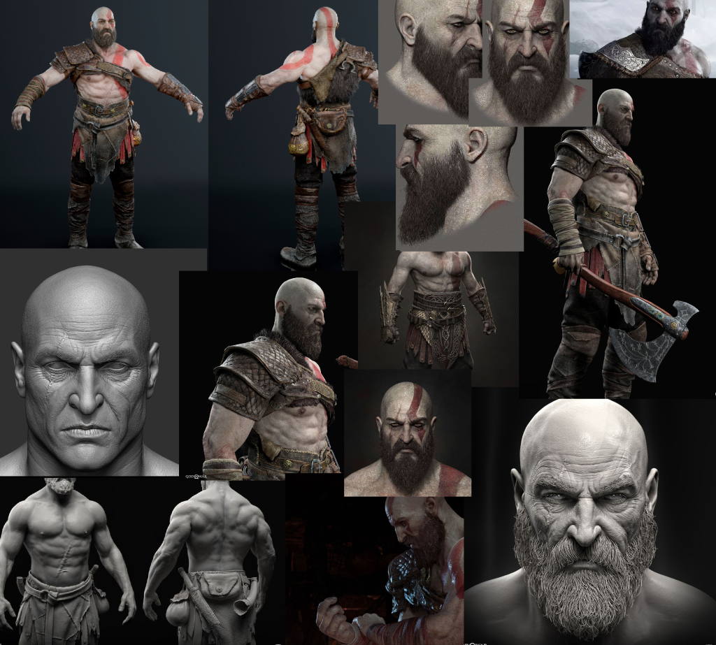
I Know because this was a anatomy based task I needed a mixture of both game references of Kratos to gain to actually get the aesthetic I was aim for but also real human anatomy refences so that the character doesn’t look disproportionate and unrealistic, in terms of the game references my aim was to gather as mainly angles of his face as possible because I knew I wanted to create a close up image of him, different angles help the whole image just look more accurate as it comes together.
Improvements:
I feel like the torso I could of made a little bore accurate; like the abs could of been slightly smaller like in the references however I don’t mind this too much as this is my own version of Kratos. I would also like to exaggerate the back muscles dramatically more i feel like they don’t represent the characters strength as much as the front does i think this turn out like that because I was focusing harder on the face anatomy.
Learnt:
This was another project which really shown me how useful using references is alongside making a model and reminded me to use them in the future work I create.
References:
Kratos pictures; I found these references all on Pinterest 2022.
Muscle anatomy google images 2022; https://www.google.com/search?q=muscular+anatomy+reference&tbm=isch&chips=q:muscular+body+reference,g_1:drawing:2FZw7Z4acuY%3D&rlz=1C1WERZ_enGB999GB999&hl=en-GB&sa=X&ved=2ahUKEwiCqL6T1vn7AhVEtScCHRLxDRAQ4lYoAHoECAEQJg&biw=2543&bih=1232#imgrc=fCBnuSOuyR7wKM&imgdii=DjLzvH7GWbjb8M
Week 9: Principles of animation.
Approach:
My approach towards this works challenge was to create a simple animation of a character doing as run then leap, wanted to focus more on the animation that the appearance in this project as it is something which i have experimented with so far.
Process:
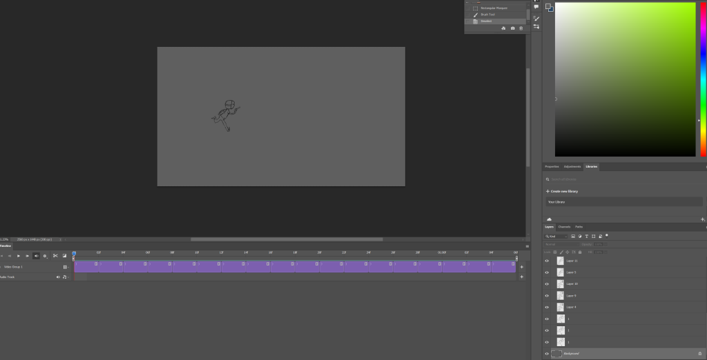
This process included a lot of rough and re-sketching my character, anything i added to the original i had to add to all of them, instead of wasting time doing this i ended up copy and pasting the original and then slightly altering the positions of each on. in the animation itself i wanted to especially include extremes, this is used to exaggerate movement in the scene and makes it interesting, i did this with the wide leaps that the character makes. i also used squash and stretch technique you can slightly see this in the feet and the sway about when it runs, i used this again to put emphasis on the movement more. i included a gun as for the character to hold just for a little bit more dramatic effect.
Inspiration:
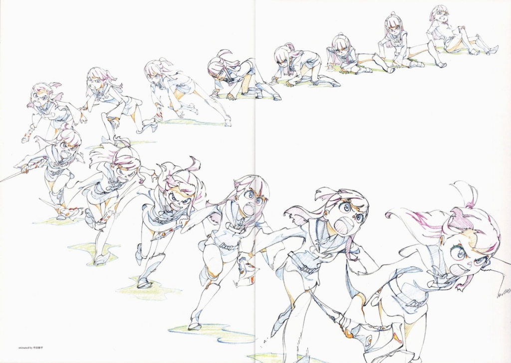
I chose this image because i loved how in every frame of the movement the character was exaggerated, i particularly took inspiration from how the feet pushed up and from the ground as the character was moving towards the screen; furthermore I liked how the clothing of the character seemed to show realistic gravity as if it seemed to be push back by the force of moving forward which really helped the illusion of moving in my scene.
Improvements:
I think if i was to improve this project i would add additional details to the character to make it seem more interesting, i would even add a few more frames so that the flow of the movement with the character is more fluent and natural.
Learnt:
Through this I haven’t only learnt how to put together a animation in Photoshop but also learnt some of the techniques to use so that it is effective such as squash and stretch and pose to pose animation.
Reference:
Week 10: Bone rigged and animation.
Approach:
for this weeks challenge i had to create an animation within Unity that included me setting up a rigged body, i initially wanted to make this animation come across like a super hero, therefore needed to figure out a how this would look on this character.
Process:
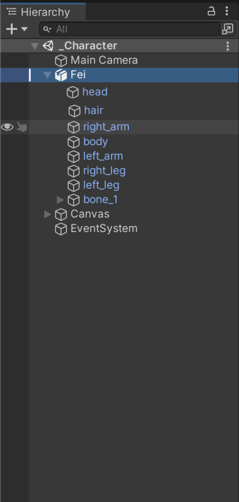
In Photoshop the 2D character had to be split int each body parts and this was because once i sent it to unity it i had to make sure i could move the arms, legs, head once i had set up the skeleton within the characters body, this makes sure that the body parts do not stray away in the scene when i am putting them in positions and when i play the scene, i also had to makes sure that they would spin around and warp the character. to create longer/ more dramatic pauses in parts of the animation i held the pose further in the scene so that it would transform into the next part i did this so that there was more tension, i also thought it would be interesting for the viewer if this animation was looped.
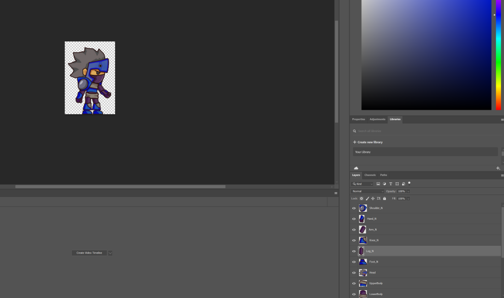
This is when i was assigning each body part in unity i labelled them this so that it would have been easier to identify them later.
Improvements:
If I was to recreate this animation i think i would of liked to make it a bit longer i could of done this by hold the pauses on for longer for example when he points, i would of like to of held that pose for a dramatic effect, when he disappears off screen i would of preferred it to be longer; slight alters just to make sure the view understands what the character is actually doing instead of it looking messy.
Learnt:
I found that having to break up the character into sections to rig and animate the body is really effective and just generally how to rig a 2D character in unity.